
Pxless Design: The Guide to Pixel-Free Web Layouts in 2026
Most websites look great on a desktop. Then someone opens them on a phone and everything falls apart. Text is too small, buttons overflow, and the layout breaks.
This problem still affects millions of websites in April 2026, and the reason is simple: they were built using fixed pixel values that cannot adapt.
Pxless design fixes this. It removes the dependency on fixed pixels and builds websites that adjust automatically to any screen, any size, and any device.
If you are a developer, designer, or just someone curious about how the modern web is built, this guide covers everything about pxless, from what it means to how it works, where it is heading, and why it matters more than ever right now.
What Is Pxless? The Direct Answer
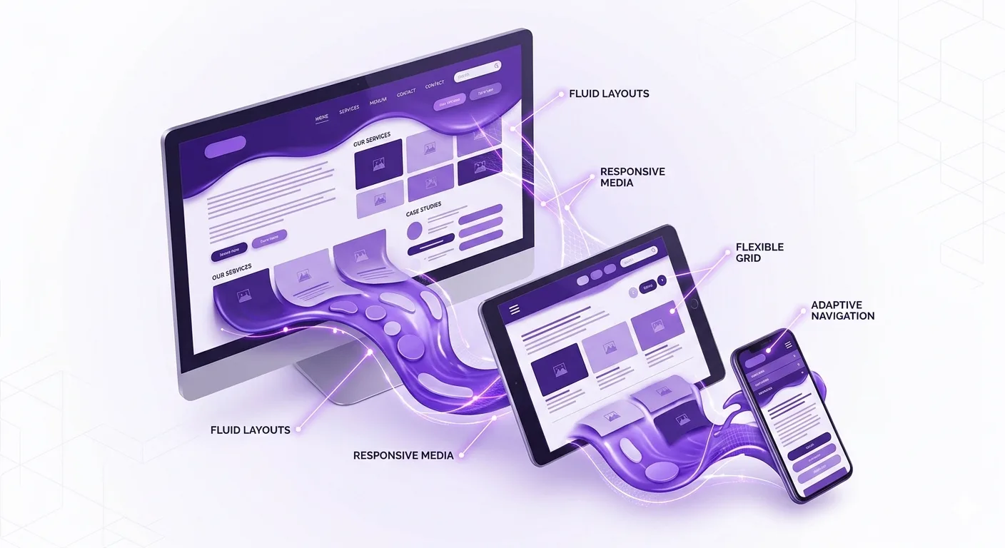
Pxless is a modern web design approach that eliminates fixed pixel (px) units and replaces them with flexible, relative measurements. These include rem, em, percentages, and viewport units like vw and vh.
The goal is to build digital layouts that scale smoothly across every screen size, from small smartphones to large monitors, without breaking or requiring separate versions.
Instead of asking “how many pixels wide should this button be?”, a pxless designer asks “how should this button behave across all screen sizes?” That shift in thinking changes everything about how a layout is built.
Why Pxless Matters Right Now in April 2026
Here is a number that should change how you think about web design: according to StatCounter Global Stats, mobile devices accounted for 64.35% of all global website traffic as of July 2025. That means nearly two out of every three people visiting a website are doing so from a phone, not a desktop.
Fixed pixel layouts were designed when desktops dominated. That era is gone. Today’s users switch between phones, tablets, laptops, smart TVs, and even foldable devices throughout the day. A website built with rigid pixel values will fail on most of them.
Pxless is the design response to this reality. It is not a passing trend. It is a practical solution to a problem that affects nearly every website on the internet right now.
Google’s Mobile-First Indexing Makes Pxless a Ranking Factor
Google switched to mobile-first indexing years ago. This means Google now ranks websites based on how well they perform on mobile devices, not desktop. A site that looks perfect on a 27-inch monitor but breaks on an iPhone is going to rank lower than one that works on both.
Pxless directly supports mobile-first performance. Flexible layouts, scalable typography, and adaptive components all contribute to better Core Web Vitals scores, which Google uses as part of its ranking algorithm.
The History That Made Pxless Necessary
Understanding where pxless comes from helps explain why it matters so much now.
The Early Web: Pixels Ruled Everything
In the early days of the internet, everyone used desktop computers with similar screen resolutions. Fixed pixel layouts made sense. A designer could set a container to 960px wide, and it looked right on nearly every screen.
Smartphones Changed the Game
When Apple released the first iPhone in June 2007, and the broader smartphone revolution took hold, the web was suddenly being viewed on screens of wildly different sizes. A 960px-wide layout looked crushed and unreadable on a 320px phone screen.
Ethan Marcotte and the Birth of Responsive Design
In May 2010, web designer Ethan Marcotte published a landmark article in A List Apart magazine introducing the term “responsive web design.” His approach used fluid grids, flexible images, and CSS media queries to let layouts adapt to different screen sizes. This was a breakthrough.
But responsive design still relied heavily on pixel-based breakpoints. Designers defined specific screen widths, like 768px for tablets or 1024px for laptops, and wrote separate rules for each. It was better than nothing, but still not fully fluid.
Pxless: The Next Step
Pxless goes beyond responsive design. Instead of adjusting at specific pixel breakpoints, it removes fixed pixel dependency entirely. Layouts flow and scale continuously, without hard jumps between states.
The World Wide Web Consortium (W3C), the main international standards body for the web, has long supported relative units in CSS specifications, and modern browsers in 2026 fully support all the tools needed to build truly pxless layouts.
The Core Units of Pxless Design
Pxless does not mean there are no measurements at all. It means those measurements are relative, not fixed. Here are the key units every developer needs to understand.
H3: rem (Root Em)
The rem unit is relative to the font size of the root HTML element. By default, most browsers set the root font size to 16px. So 1rem equals 16px, 2rem equals 32px, and so on.
The big advantage is accessibility. If a user increases their browser’s default font size for readability, rem-based layouts scale with it automatically. Fixed pixel layouts do not.
H3: em (Element Em)
The em unit is relative to the font size of the parent element. If a button’s font size is set to 18px and its padding is set to 1em, the padding becomes 18px. This is useful for components that should scale based on their own context.
The catch with them is compounding. If a parent element uses 1.2em and a child inside it also uses 1.2em, the child ends up at 1.44 times the root size. Deep nesting can cause unpredictable results, which is why rem is often preferred for typography.
H3: Viewport Units (vw and vh)
vw stands for viewport width. 1vw equals 1% of the browser window’s width. vh stands for viewport height. 1vh equals 1% of the browser window’s height. These units are ideal for full-screen sections and hero areas.
One important note for April 2026: on mobile browsers, 100vh can sometimes include the browser’s address bar in the calculation, causing overflow issues. Modern CSS offers dvh (dynamic viewport height) as a fix.
H3: Percentages
Percentage units are relative to the parent element’s size. If a parent container is 600px wide and a child is set to 50%, the child renders at 300px. Percentages are the backbone of fluid grid systems.
H4: The clamp() Function
The CSS clamp() function is a powerful pxless tool. It takes three values: a minimum, a preferred, and a maximum. For example, font-size: clamp(1rem, 2.5vw, 2rem) means the text will never be smaller than 1rem, never larger than 2rem, but will scale smoothly between those values based on screen width. This is fluid typography done right.
Modern CSS Tools That Make Pxless Work
Pxless design would not be practical without modern CSS tools. These three are the foundation.
Flexbox
Flexbox is a one-dimensional layout system that lets elements grow, shrink, and align automatically. A row of buttons, a navigation bar, or a card grid can all be built with Flexbox. Elements share available space proportionally rather than sitting at fixed pixel widths.
CSS Grid
CSS Grid handles two-dimensional layouts. It lets designers create rows and columns that adapt to available space. Using fractional units (fr) instead of pixels means columns resize smoothly. A three-column desktop grid can gracefully collapse to one column on mobile without breakpoint hacks.
Container Queries
Container queries, now fully supported in all major browsers as of 2026, are arguably the most powerful pxless tool available. Traditional media queries respond to the screen’s total viewport width. Container queries respond to the size of a specific element’s parent container.
Think about a product card component. On a wide layout, it shows an image, title, and description side by side. On a narrow sidebar, the same component stacks vertically. With container queries, that component handles its own responsive behavior without relying on global screen width rules. This makes components truly portable and reusable.
What Does Pxless Look Like in Practice?
Understanding pxless in theory is one thing. Seeing how it applies to real elements is another.
H3: Typography
A developer without pxless knowledge might write: font-size: 16px. This is fixed. If a user on a low-vision setting has increased their browser’s default font size to 20px, the text stays at 16px and ignores their preference.
A pxless approach writes: font-size: 1rem. Now the text scales with the user’s browser settings. Add clamp() for fluid scaling: font-size: clamp(1rem, 2vw, 1.5rem) and the text adjusts smoothly between small and large screens.
H3: Images
A common mistake is setting images to a fixed width, like width: 400px. That image will overflow its container on a small phone. The pxless fix is simple: max-width: 100%; height: auto. The image now shrinks to fit any container while keeping its proportions.
H3: Spacing and Padding
Think about a developer in Lahore building a portfolio site with a fixed padding of 40px on the main content area. On mobile, 40px of padding on each side eats up most of the screen width, leaving almost no room for text. With pxless, using padding: 5% or padding: 2.5rem adapts the spacing relative to the screen, keeping content readable everywhere.
Pxless vs Pixel-Based vs Responsive Design
| Feature | Pxless | Pixel-Based | Responsive (Breakpoints) |
| Adapts to all screens | Yes, continuously | No, breaks on new sizes | Partially, at set widths |
| Accessibility support | Strong, scales with user settings | Weak, ignores user preferences | Moderate |
| Maintenance effort | Low, one scalable system | High, separate fixes per device | Medium, maintain breakpoints |
| Future device support | Yes, inherently flexible | No, needs constant updates | Partial |
| Google SEO benefits | Strong, mobile-first ready | Weak | Good |
| Code complexity | Moderate learning curve | Simple but fragile | Moderate |
The One Mistake 80% of Developers Make When Going Pxless in 2026
Most developers who attempt pxless make the same critical error: they only change font sizes and leave everything else in pixels.
They switch their font-size to rem. They celebrate. Then they leave all their padding, margin, border-radius, and container widths in pixels. The result is a layout that has scalable text inside a completely rigid shell. When a user with accessibility needs increases their browser font size, the text grows, but the containers stay fixed, creating overflow and clipping.
True pxless design requires a system-level mindset. Spacing, padding, and layout containers all need to be relative. The goal is not to find one element and change its unit. The goal is to build a design system where nothing is locked to a fixed pixel value unless there is a specific technical reason, like a 1px border where you genuinely need precision.
Start by auditing your existing stylesheets. Look for every instance of px that is not a border or box-shadow. Replace each one with rem, em, or percentage, and test the result. That audit process is where the real transition to pxless happens.
What Is Pxless Design? (AEO Answer Box)
Pxless design is a web development approach that removes fixed pixel units from layout, typography, and spacing. It replaces them with relative units like rem, em, percentages, vw, and vh. This allows websites to scale automatically across all screen sizes without breaking. The result is a more accessible, mobile-friendly, and future-proof digital experience for every user.
Is Pxless Design Good for SEO?
Yes. Pxless design directly supports better SEO performance in 2026. Google uses mobile-first indexing, meaning it ranks websites based on their mobile performance. Pxless layouts adapt naturally to mobile screens, reducing bounce rates and improving Core Web Vitals scores like Cumulative Layout Shift (CLS).
According to Marketing LTB’s 2026 mobile statistics research, 74% of users abandon a site if it takes more than 5 seconds to load, and 53% leave if pages load in more than 3 seconds. Pxless layouts reduce redundant code and layout recalculations, contributing to faster load times that keep users on the page and search rankings higher.
Pxless and Accessibility: Why This Is Non-Negotiable
Accessibility is not optional. The Web Content Accessibility Guidelines (WCAG), published by the W3C, specifically recommend using relative units to support users who adjust their browser settings.
Consider someone with low vision who has set their browser default font size to 24px instead of 16px. On a site using rem-based typography, all text scales proportionally. On a site using fixed pixel values, the text stays at whatever size the developer decided, ignoring the user’s settings entirely.
Pxless also supports Zoom. When a user zooms in on a mobile device, flexible layouts reflow and stay usable. Fixed pixel layouts often overflow horizontally, forcing users to scroll sideways, which the WCAG classifies as an accessibility failure.
In April 2026, accessibility lawsuits against non-compliant websites continue to rise. Building with pxless principles is one of the most practical ways to stay compliant and serve every user properly.
Tools and Frameworks That Support Pxless in 2026
These tools make pxless development faster and easier.
- Tailwind CSS: A utility-first CSS framework that defaults to rem-based sizing and encourages relative spacing throughout.
- Figma: The leading design tool now supports design tokens and fluid resizing, making it easier to design with pxless principles from the start.
- CSS Unit Converters: Tools available at sites like Impeccify.com and FrontendTools.tech let developers quickly convert pixel values to rem or em during migration.
- React, Vue, and Svelte: All three major frontend frameworks support component-driven architecture that pairs naturally with container queries and pxless design tokens.
- Webflow: Its visual CSS editor now surfaces relative unit options prominently, helping no-code builders adopt pxless principles without writing raw CSS.
The Future of Pxless: Where It Is Heading
Pxless is not finished evolving. Several trends will push it further in the coming years.
Foldable and Dual-Screen Devices
Samsung’s Galaxy Z Fold series and Microsoft’s Surface Duo represent a new class of devices that can change their own screen width mid-session. A user might unfold their phone while reading an article. A pixel-based layout cannot handle that. A pxless layout adjusts instantly.
AI-Assisted Layout Generation
Tools like Google’s Project IDX and emerging AI code assistants are beginning to generate pxless-first CSS automatically. Developers who understand the principles behind pxless will get better results from these tools and will know how to fix what they generate.
Design Tokens at Scale
Design tokens, which are named variables for spacing, color, and typography values, are becoming the standard way to build scalable design systems. When tokens use relative units, the entire system becomes pxless by default. Companies like Atlassian and IBM have already adopted token-based design systems that align closely with pxless principles.
How to Start Moving Your Website to Pxless Today
You do not need to rebuild your entire site at once. A gradual migration works.
- Set your root HTML font size to font-size: 100% instead of a fixed pixel value. This respects the user’s browser settings.
- Replace all font-size: Xpx declarations with rem equivalents. Divide the pixel value by 16 to get rem.
- Replace fixed-width containers with percentage-based or max-width values.
- Switch spacing, padding, and margin values to rem or em.
- Test on real physical devices, not just browser resizing tools.
- Add the viewport meta tag to every page: <meta name=”viewport” content=”width=device-width, initial-scale=1.0″>.
- Audit using Chrome DevTools’ device simulation and Lighthouse accessibility audit.
Conclusion
Pxless design solves one of the most persistent problems in web development: layouts that work only on one screen size. By replacing fixed pixel values with relative units like rem, em, and vw, developers build sites that adapt automatically to any device, any screen size, and any user preference.
With mobile devices accounting for 64.35% of global web traffic as of July 2025, according to StatCounter, and Google ranking sites based on their mobile performance, pxless is not a nice-to-have improvement. It is a practical requirement for anyone building for the real web in April 2026.
Start with typography. Fix the spacing. Adopt container queries. The web does not have one screen size, and your layout should not either.
For more background on how web standards and layout approaches have evolved, the history of CSS on Wikipedia offers useful context on the specification that makes pxless design possible.
Frequently Asked Questions About Pxless
What does pxless mean in web design?
Pxless means building websites without fixed pixel (px) units as the primary measurement. Instead, developers use relative units like rem, em, percentages, vw, and vh. These units scale based on screen size, user settings, or parent containers, making layouts flexible and adaptable across all devices automatically.
Why is pxless better than using pixels?
Pixels create fixed, rigid layouts that do not adapt to different screens. Pxless uses relative units that scale automatically. This improves usability on mobile devices, supports accessibility needs like increased font size, reduces maintenance effort, and helps websites rank better on Google through improved mobile performance.
Is pxless the same as responsive design?
They are related but not the same. Responsive design adjusts a layout at specific pixel breakpoints. Pxless removes pixel dependency entirely, allowing layouts to scale continuously without breakpoints. Pxless can be used inside a responsive design system, and together they create the most flexible and future-proof approach available in 2026.
What units does pxless use instead of pixels?
The main pxless units are rem (relative to root font size), em (relative to parent font size), % (relative to parent element size), vw (percentage of viewport width), vh (percentage of viewport height), and fr (fraction of available space in CSS Grid). The clamp() function combines minimum, preferred, and maximum values for fluid scaling.
Does pxless affect website performance?
Yes, positively. Pxless layouts tend to require less redundant CSS because one flexible rule covers many screen sizes. Fewer media query overrides mean smaller stylesheets and faster load times. Faster loading directly reduces bounce rates and improves Google rankings, according to consistent findings from Google’s own Core Web Vitals research.
Is pxless hard to learn?
The concepts are straightforward but require a shift in how developers think about layout. Instead of asking “how many pixels?”, the question becomes “how should this behave?”. Most developers find that once they practice with rem and Flexbox for a few projects, the pxless mindset becomes natural. The biggest challenge is migrating existing pixel-heavy codebases.
Does pxless work with Tailwind CSS?
Yes. Tailwind CSS uses rem for its sizing scale by default, which aligns closely with pxless principles. Its utility classes for padding, margin, font size, and spacing all generate relative CSS values rather than fixed pixels. Tailwind is one of the most pxless-friendly frameworks available for rapid development in 2026.
Does pxless design help with accessibility?
Absolutely. Accessibility is one of pxless design’s biggest strengths. Users who increase their browser’s default font size for readability get properly scaled layouts when sites use rem. Zoom works without horizontal overflow. The W3C’s WCAG guidelines recommend relative units specifically because they respect user preferences and assistive technology settings.
Should I use rem or em for font sizes in a pxless design?
Use rem for most font sizes. It scales based on the root font setting, which keeps sizing consistent and predictable across a whole page. Use them for component-level spacing where you want elements to scale with their own font size, like button padding that should grow when the button text grows. For global typography, rem is the safer and more maintainable choice.
What is a container query, and how does it relate to pxless?
A container query is a CSS feature that lets an element change its style based on the size of its parent container rather than the whole browser window. It is a core pxless tool because it makes individual components responsive to their context. A card component can stack vertically in a narrow sidebar and display horizontally in a wide content area, all without global breakpoints. Container queries are fully supported in all major browsers as of 2026.